


“I knew it was one of your books – you have such a strong brand.”
This kind reader tweeted this a year ago and my little heart swelled. The gold futuristic eagle on a dark background had spread its wings everywhere.
Scroll back to 2013. Excited in the run-up to the publication of INCEPTIO, my first book, I was stunned by the cover that SilverWood Books produced. Here was the embodiment of my book: imperial purple, a gold eagle, symbol of Roman power, yet in a thoroughly modern design. Added to that, the ‘proper’ Roman font – Trajan Pro – as seen on inscriptions still visible across Europe. A tingle flowed through my body. (Well, it was exciting!)
And so it has been for the past five years and eight books, each book with a different deep jewel-like cover echoing the contents.
But times change. People change. Habits and wishes change.
When historians write about our age, the one expression to characterise it will be ‘continuous change’. I’ll come clean. My book sales are steady and from the comments by readers, I gather they enjoy them enough to give them hundreds of five stars across the series. But I’d love to discover more readers and introduce Roma Nova to them. So I dived into the murky science of marketing.
What do potential new readers expect when they see my covers? Do they see adventure thrillers featuring strong heroines, a touch of history and mystery, tales of courage, failure, triumph, heartache and resolve? Hm. Perhaps the eagle image, dark colours and Roman script no longer had that elusive ‘pick-up’ element.
Learning point: Emotion and character needed to be brought in.
Did the covers convey action and movement? Certainly, they conveyed strength and purposefulness, but there was no hint of risk, personal danger or taking the initiative. And you can’t say that either of my heroines, Carina or Aurelia, is backward in any of those aspects!
Learning point: Show some dynamism.
People vs. patterns. I rejected a cover with a face in 2013 because I couldn’t see it fitting within the graphic. It would have confused the impact of the eagle. From a five years’ later viewpoint, I still think that was the right decision. Trying to fit everything together is not a good approach, nor is overcrowding a cover. The whole concept needed a complete rethink.
Learning point: Don’t tinker – start again.
Being hard-headed, the job of a book cover is to let readers know what it’s about and whether they might be interested – all within a second or two. If the cover isn’t compelling passers-by (real or virtual) to look further by reading the summary and reviews, they won’t come near to buying.
Researching this was a hard process. Taking the decision to change the whole look of the Roma Nova covers was excruciating. But I had five solid years of experience in the book world: interacting with readers, absorbing reviews, listening to fellow authors, discovering new techniques and trends. I was also expanding the series, firstly by dropping in a novella (CARINA), then a collection of short stories (ROMA NOVA EXTRA) Currently I’m drafting a novella set in the 1970s featuring Aurelia, set between AURELIA and INSURRECTIO, which would further mess up the existing numbering order!
A fresh approach to the whole series was needed. I’ve decided to split the stories into two strands within the Roma Nova series: Carina Mitela adventures and Aurelia Mitela adventures.
Readers have described my books as a cross between Lindsey Davis’ Roman detective Falco and The Hunger Games. They’ve also been likened to Manda Scott and Kate Mosse’s books. Conn Iggledun, Simon Scarrow, Elizabeth Chadwick, Sue Cook and Kate Quinn have said nice things about them. I’d like to think they’d appeal to readers of JD Robb and Robert Harris (or is that hubris?).
Back to the covers…
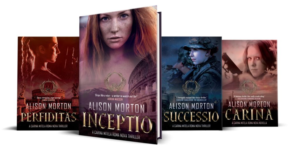
I commissioned Jessica Bell Design to draw up some concepts for the whole series and chose the one that conveyed the ‘feel’ of Roma Nova best. But then I had to put my own emotional response aside and use my logical brain. Which would most appeal to readers? And address the learning points from my analysis?
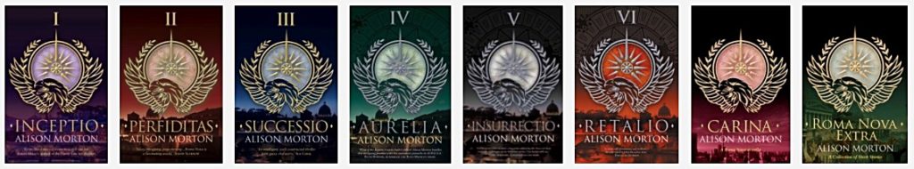
I asked Jessica to keep the original background colours: INCEPTIO purple, PERFIDITAS blood red, CARINA in between, SUCCESSIO blue, AURELIA green, INSURRECTIO black and RETALIO amber and to include the signature eagle graphic in the mix.
She was a joy to work with: imaginative, professional and supportive, especially of some of my dafter ideas. But she was also ruthless in a very friendly way when my suggestions were off-piste; she was right every time.

Left to right: Joanna Penn, Jessica Bell, me, Rebecca Lang at the London Book Fair 2017
Delighted isn’t the right word. Thrilled is a bit nearer. Ecstatic is nearly there. Shocked and overwhelmed in a very positive way is better. Judge for yourselves. I think Roma Nova is about to storm off on some exciting new adventures.
Coming for the ride?
Alison Morton is the author of Roma Nova thrillers – INCEPTIO, PERFIDITAS, SUCCESSIO, AURELIA, INSURRECTIO and RETALIO. CARINA, a novella, and ROMA NOVA EXTRA, a collection of short stories, are now available. Audiobooks are available for the first four of the series.
Get INCEPTIO, the series starter, FREE as a thank you gift when you sign up to Alison’s monthly email newsletter. You’ll also be first to know about Roma Nova news and book progress before everybody else, and take part in giveaways.